Colour guide: The coffee shop owner's journey
العربيةThe colours this page uses, each as a token with its light and dark value and the class in the site code, then every component of the page with its states in both themes, and the page sections side by side.
How it works
1. The theme sits on <html>
One attribute sets the theme. Without it the device setting applies; once the visitor taps the moon / sun button the choice is saved. A link ending in ?theme=dark opens the page dark.
<html data-theme="dark">
2. Every colour comes from a token
No hex values inside components. Use the token and it resolves to the right value in each theme.
background: var(--muna-surface);
3. Fixed colours stay as they are
The dark green header and footer, brand green buttons and badges, photos and logos have one value in both themes.
--muna-fixed-003200: #003200; /* both */
Tokens
The colours of this page content (header and footer are in the general guide). Measured element by element in both themes.
| Token | Light | Dark | Used for | Class in the code |
|---|---|---|---|---|
| Backgrounds | ||||
--muna-surface | #ffffff | #14251d | cards and blocks, section backgrounds (23) | .service-card · .timeline-item |
--muna-surface-3 | #d9d9d9 | #22362b | cards and blocks (5) | .timeline-circle |
--muna-divider | #1a1e1a | #6b7f72 | divider lines (1) | .timeline-divider |
| Text | ||||
--muna-text | #303536 #000000 | #e9eee9 | headings, body text, cards and blocks (52) | .timeline-circle |
--muna-text-brand-2 | #155615 | #c0d9c6 | headings, buttons (2) | .header-active · .next-stage-button |
--muna-text-brand | #003200 | #9fc6a9 | body text (1) | inherited |
| Icons (SVG) | ||||
--muna-icon-8dce8d | #155615 | #8dce8d | icons (12) | inherited |
--muna-icon-101010 | #efefef | #101010 | icons (4) | inherited |
--muna-icon-muted | #9da4ae | #a3afa8 | icons (3) | inherited |
--muna-icon-brand-2 | #155615 | #c0d9c6 | icons (3) | inherited |
| Borders and lines | ||||
--muna-border | #f3f4f6 #d9d9d9 | #2c4136 | cards and blocks, section backgrounds (24) | border-gray-100 · .timeline-item |
--muna-border-off | #303536 | none | divider lines (1) | .timeline-divider |
--muna-border-4f8f62 | #155615 | #4f8f62 | buttons (1) | .next-stage-button |
| Fixed in both themes | ||||
--muna-fixed-brand | #155615 | same | cards and blocks (2) | .timeline-item · .timeline-circle |
--muna-fixed-white | #ffffff | same | body text, headings (2) | inherited |
--muna-fixed-f9fafb | #f9fafb | same | cards and blocks (1) | .timeline-circle |
Components and states
Real crops of each component: light on the left, dark on the right, with the state under each one.
Heading · رحلة ملاك المقاهي
رحلة ملاك المقاهي · text-2xl font-semibold text-center

| State | Part | Light | Dark |
|---|---|---|---|
| default | text | #003200 | #9fc6a9 |
Heading · التأسيس والانطلاق
رحلة ملاك المقاهي · h2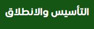
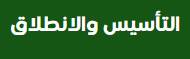
| State | Part | Light | Dark |
|---|---|---|---|
| default | text | #ffffff | same |
Heading · دراسة السوق
رحلة ملاك المقاهي · header-active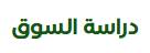
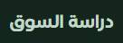
| State | Part | Light | Dark |
|---|---|---|---|
| default | text | #155615 | #c0d9c6 |
Heading · مخطط نموذج العمل التجاري
رحلة ملاك المقاهي · h3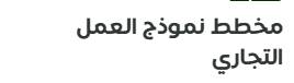
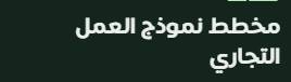
| State | Part | Light | Dark |
|---|---|---|---|
| default | text | #303536 | #e9eee9 |
Button · المرحلة التالية
رحلة ملاك المقاهي · next-stage-button btn btn-primary
| State | Part | Light | Dark |
|---|---|---|---|
| default | text | #155615 | #c0d9c6 |
| default | frame | #155615 | #4f8f62 |
| hover | text | #003200 | #9fc6a9 |
| hover | frame | #003200 | #4f8f62 |
Interactive item · 01 التأسيس والانطلاق
رحلة ملاك المقاهي · timeline-item timeline-item-active
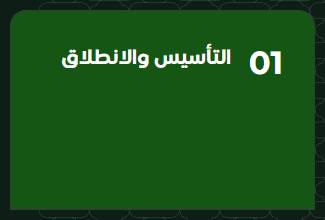
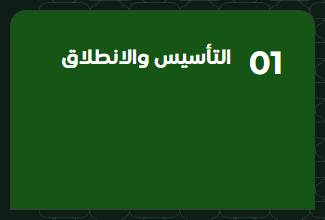
| State | Part | Light | Dark |
|---|---|---|---|
| default | background | #155615 | same |
| default | text | #ffffff | same |
| default | frame | #d9d9d9 | #2c4136 |
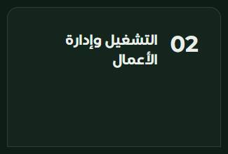
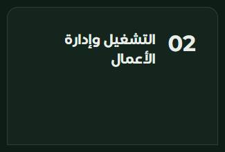
Interactive item · 02 التشغيل وإدارة الأعمال
رحلة ملاك المقاهي · timeline-item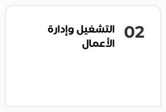
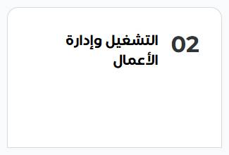
| State | Part | Light | Dark |
|---|---|---|---|
| default | background | #ffffff | #14251d |
| default | text | #303536 | #e9eee9 |
| default | frame | #d9d9d9 | #2c4136 |
Interactive item · 1 دراسة السوق
رحلة ملاك المقاهي · flex gap-[15px] lg:gap-[30px] w-full items-center bg-transparent border-0 p-0 cursor-pointer text-start



| State | Part | Light | Dark |
|---|---|---|---|
| default | text | #f9fafb | same |
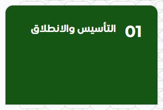
Card · 01 التأسيس والانطلاق
رحلة ملاك المقاهي · timeline-item timeline-item-active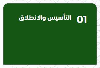
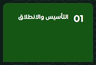
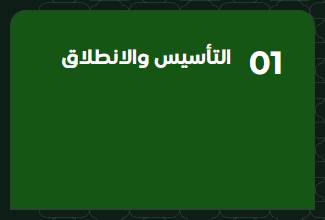
| State | Part | Light | Dark |
|---|---|---|---|
| default | background | #155615 | same |
| default | text | #ffffff | same |
| default | frame | #d9d9d9 | #2c4136 |
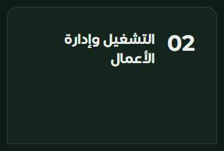
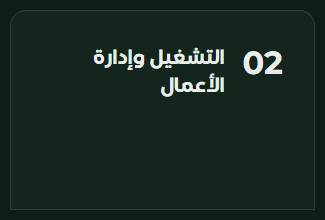
Card · 02 التشغيل وإدارة الأعمال
رحلة ملاك المقاهي · timeline-item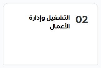
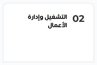
| State | Part | Light | Dark |
|---|---|---|---|
| default | background | #ffffff | #14251d |
| default | text | #303536 | #e9eee9 |
| default | frame | #d9d9d9 | #2c4136 |
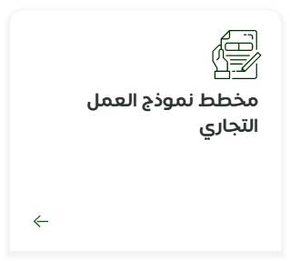
Card · مخطط نموذج العمل التجاري
رحلة ملاك المقاهي · service-card xl:max-w-[413px] lg:h-[265px] px-[31px] py-[14px] lg:p-[25px] m-[1px] flex flex-col justify-between shadow-sm border border-gray-100 tran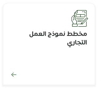
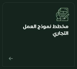
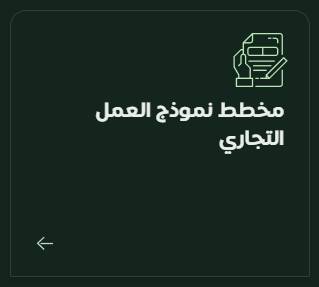
| State | Part | Light | Dark |
|---|---|---|---|
| default | background | #ffffff | #14251d |
| default | text | #303536 | #e9eee9 |
| default | frame | #f3f4f6 | #2c4136 |
Tag · 1
رحلة ملاك المقاهي · timeline-circle flex items-center justify-center z-10 timeline-circle-active


| State | Part | Light | Dark |
|---|---|---|---|
| default | background | #155615 | same |
| default | text | #f9fafb | same |
Tag · 2
رحلة ملاك المقاهي · timeline-circle flex items-center justify-center z-10


| State | Part | Light | Dark |
|---|---|---|---|
| default | background | #d9d9d9 | #22362b |
| default | text | #000000 | #e9eee9 |
Icons


| State | Part | Light | Dark |
|---|---|---|---|
| default | icon | #155615 | same |
| default | icon | #9da4ae | #a3afa8 |
Sections
Screenshots of the page itself, light then dark. The site content is in Arabic.
رحلة ملاك المقاهي
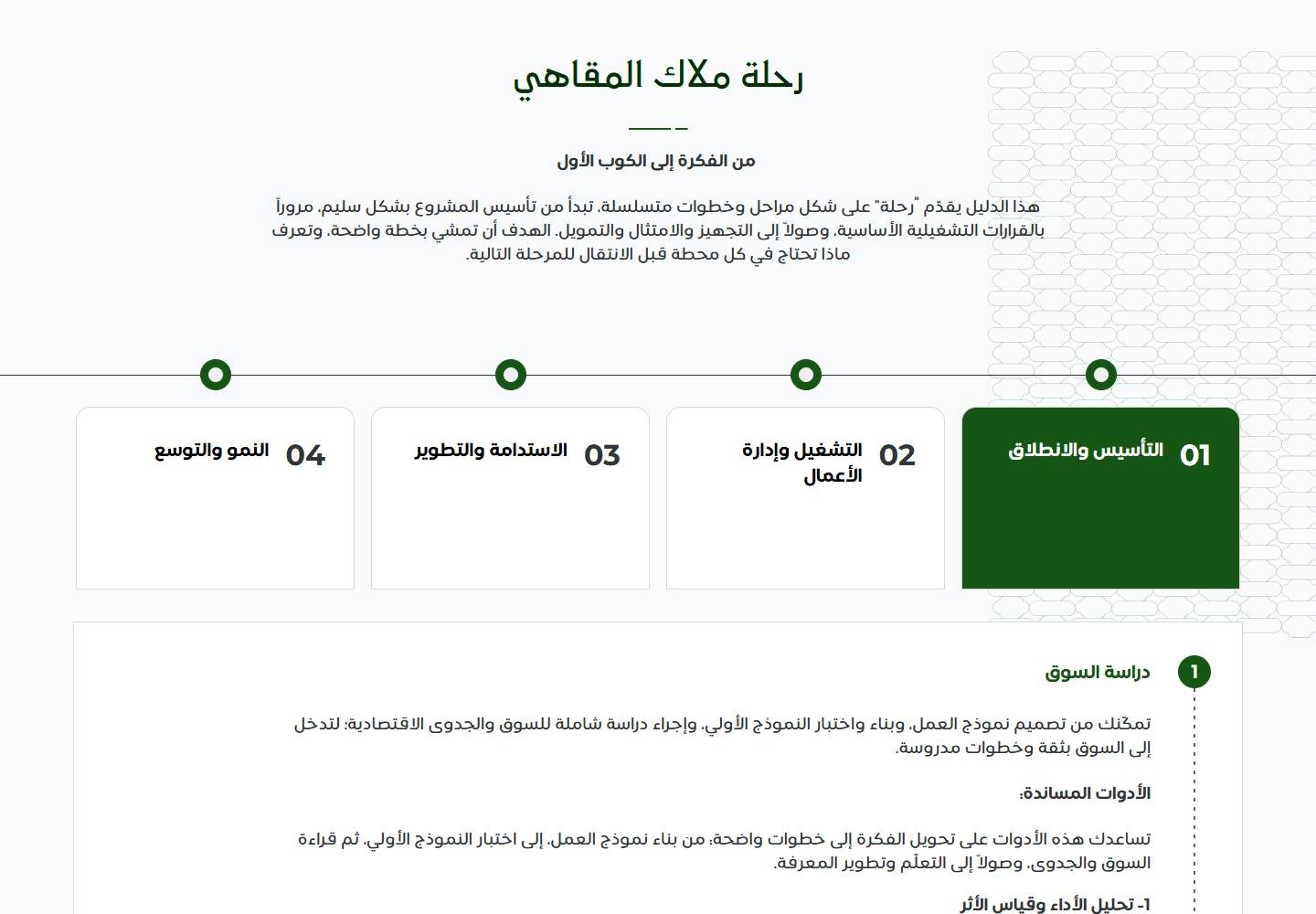
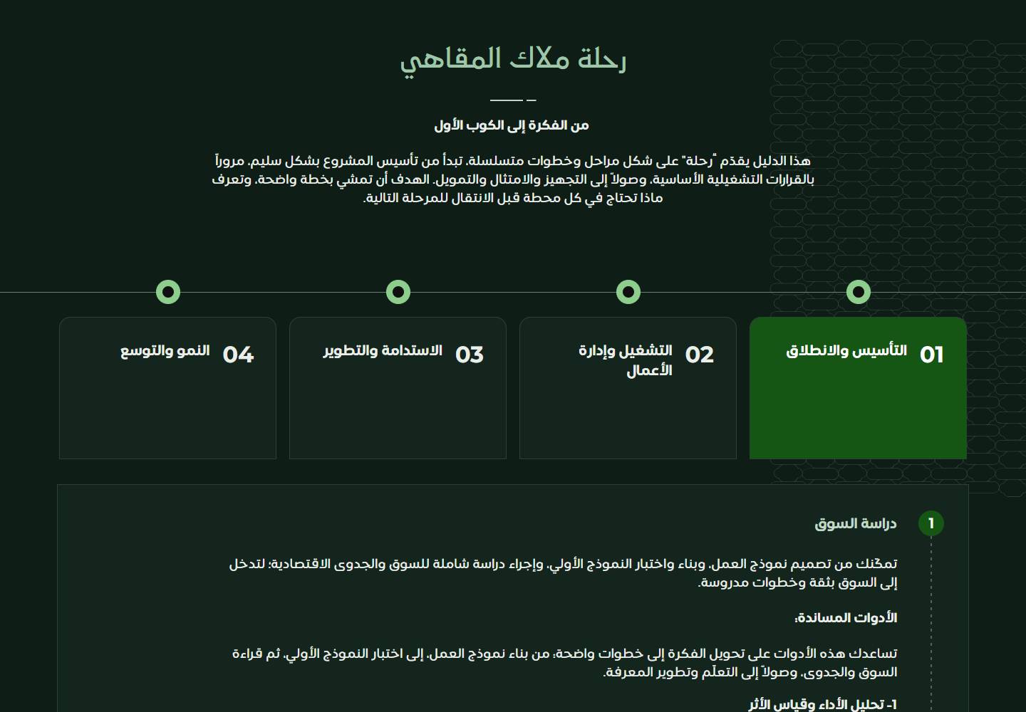
Code
The tokens as CSS variables for both themes. They also work as Figma variables with two modes, Light and Dark.
/* Almunawarah · The coffee shop owner's journey — colour tokens */
:root {
  --muna-surface:     #ffffff;
  --muna-surface-3:   #d9d9d9;
  --muna-divider:     #1a1e1a;
  --muna-text:        #303536;  /* also #000000 */
  --muna-text-brand-2: #155615;
  --muna-text-brand:  #003200;
  --muna-icon-8dce8d: #155615;
  --muna-icon-101010: #efefef;
  --muna-icon-muted:  #9da4ae;
  --muna-icon-brand-2: #155615;
  --muna-border:      #f3f4f6;  /* also #d9d9d9 */
  --muna-border-off:  #303536;
  --muna-border-4f8f62: #155615;
  --muna-fixed-brand: #155615;
  --muna-fixed-white: #ffffff;
  --muna-fixed-f9fafb: #f9fafb;
}

:root[data-theme="dark"] {
  --muna-surface:     #14251d;
  --muna-surface-3:   #22362b;
  --muna-divider:     #6b7f72;
  --muna-text:        #e9eee9;
  --muna-text-brand-2: #c0d9c6;
  --muna-text-brand:  #9fc6a9;
  --muna-icon-8dce8d: #8dce8d;
  --muna-icon-101010: #101010;
  --muna-icon-muted:  #a3afa8;
  --muna-icon-brand-2: #c0d9c6;
  --muna-border:      #2c4136;
  --muna-border-off:  transparent;
  --muna-border-4f8f62: #4f8f62;
}